UI Design & Logo Design
TRUPAYhub
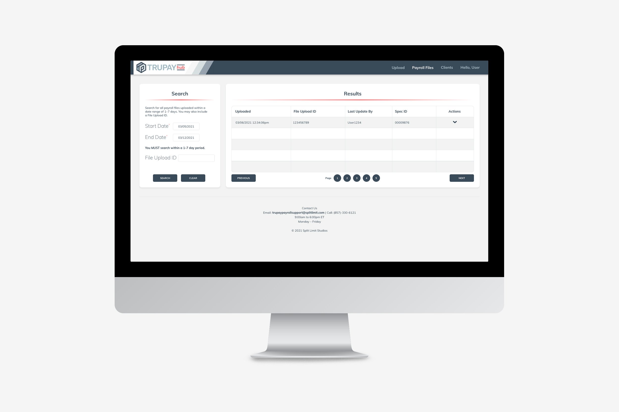
TRUPAYhub was created to be a leaner version of its parent product, TRUPAY, and is geared toward users who prioritize efficiency over depth of features. Typography and color palette remain the same across the platforms to emphasize their connection. The TRUPAYhub UI uses a bright, contrasting color throughout to differentiate the products. A clean look with large type and plenty of open space makes TRUPAYhub navigable and pleasant to use. An amended TRUPAY logo completes the look.


